Introduction
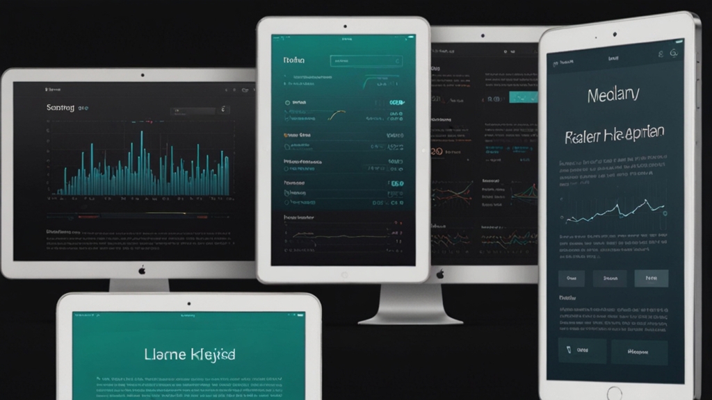
In today's digital age, responsive design is no longer a luxury but a necessity. Users access websites from various devices with different screen sizes and resolutions. Ensuring a smooth and consistent experience across all these mediums is paramount. Front-end frameworks have emerged as pivotal tools in achieving this goal. This article delves into why front-end frameworks are essential for responsive design.
Streamlined Development Process
Front-end frameworks offer a streamlined development process by providing pre-designed components and built-in functionalities. This reduces the time developers need to spend on writing code from scratch. Most frameworks come with a grid system that simplifies designing responsive layouts. By using these grids, developers can create complex designs that adapt seamlessly to any screen size.
Bootstrap, one of the most popular front-end frameworks, uses a 12-column grid system. This allows developers to create flexible layouts that adjust dynamically as the viewport changes.
Consistent User Experience
A consistent user experience across different devices builds trust and reliability. Front-end frameworks ensure this consistency by providing standardized CSS and JavaScript components. These components function uniformly, regardless of the device or browser. By using a front-end framework, designers and developers can ensure that elements like buttons, navigation bars, and forms look and function the same on desktops, tablets, and smartphones.
Furthermore, most frameworks are extensively tested across various browsers and devices. This ensures that the end product is robust and performs well in real-world scenarios, saving developers from unexpected issues and bugs that could compromise user experience.
Ease of Maintenance and Scalability
Web applications are continually evolving, requiring frequent updates and maintenance. Front-end frameworks facilitate easier maintenance and scalability by offering modular components. Developers can easily update or replace individual components without affecting the overall application. This modularity ensures that the website remains up-to-date without extensive rewrites.
Imagine having to update your website's navigation menu. With a front-end framework, you can make changes in one place, and it will reflect throughout the site, ensuring consistency and saving time.
Enhanced Cross-Browser Compatibility
Cross-browser compatibility is a significant challenge in web development. Different browsers interpret code in varying ways, leading to inconsistencies. Front-end frameworks address this issue by incorporating best practices and fallback mechanisms. They ensure that websites render correctly across all major browsers, offering users a seamless experience regardless of their preferred browser.
This is particularly crucial for responsive design, as users might access your site from different browsers on different devices. The frameworks handle the heavy lifting, allowing developers to focus on creating engaging content and functionalities.
Built-In Responsiveness
One of the primary reasons front-end frameworks are essential for responsive design is their inherent responsiveness. These frameworks are built with mobile-first principles, ensuring that designs are optimized for small screens first and then scaled up for larger screens. This approach guarantees that users on mobile devices have a superior experience without compromising the desktop version.
Frameworks like Foundation and Bulma are designed with mobile-first principles, ensuring that your website is inherently responsive and performs well on any device.
Conclusion
Front-end frameworks have revolutionized the way developers approach responsive design. They offer a systematic and efficient way to create websites that are not only visually appealing but also functionally robust across all devices. From streamlining the development process to ensuring a consistent user experience, the benefits are manifold. As the digital landscape continues to evolve, utilizing front-end frameworks will remain a cornerstone of responsive and user-centric web design.


