Mastering Media Queries: The Key to Responsive Design
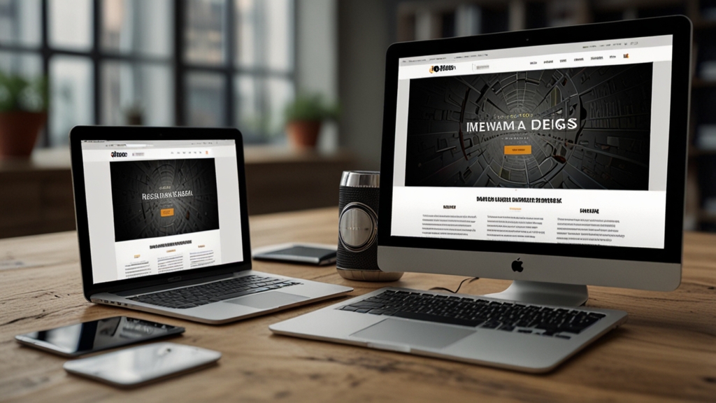
In today's digital age, devices come in all shapes and sizes. From large desktop monitors to tiny smartwatch screens, the diversity in display dimensions is vast. For web developers, this introduces a significant challenge: how to ensure that a website looks good and functions well across all these devices. The solution lies in mastering media queries – the cornerstone of responsive design.
What Are Media Queries?
Media queries are a feature of CSS that enables content rendering to adapt to varying conditions such as screen size, resolution, and orientation. They allow developers to apply different styles based on specific criteria, ensuring that a website looks optimal regardless of the device used to access it.
At the core, a media query consists of a media type and one or more expressions that check for conditions of particular media features, such as:
screen (media type): Describes screens of all kinds, including desktops, tablets, and mobile devices.
(min-width: 768px) (media feature): Checks if the viewport width is at least 768 pixels.
Basic Syntax of Media Queries
The syntax of a basic media query is simple. Here’s an example:
@media screen and (max-width: 600px) {
  body {
    background-color: lightblue;
  }
}
This media query will apply the styles within its block only when the viewport width is 600 pixels or less.
Common Use Cases for Media Queries
1. Adjusting Layouts
One of the most common uses of media queries is to adjust the layout of a webpage. For instance, changing a multi-column layout into a single-column layout on smaller screens:
@media (max-width: 768px) {
  .container {
    display: flex;
    flex-direction: column;
  }
}
2. Resizing Text
Ensuring text readability on different devices is crucial. You can increase or decrease the font size based on screen width:
@media (max-width: 480px) {
  body {
    font-size: 16px;
  }
}
@media (min-width: 481px) and (max-width: 768px) {
  body {
    font-size: 18px;
  }
}
@media (min-width: 769px) {
  body {
    font-size: 20px;
  }
}
3. Hiding/Displaying Elements
Sometimes, certain elements are not necessary or practical on smaller screens, such as a large image banner or sidebar:
@media (max-width: 600px) {
  .sidebar {
    display: none;
  }
}
Best Practices for Using Media Queries
1. Mobile-First Design
Adopt a mobile-first approach by writing styles for small screens first, then use media queries to add styles for larger screens. This approach ensures better performance and a cleaner code structure.
2. Breakpoints
Choose breakpoints based on your content rather than specific devices. Common breakpoints include 480px, 768px, 1024px, and 1200px, corresponding to typical device sizes, but the content should dictate the most effective breakpoints.
Remember: "Content is king." Tailoring your breakpoints to the needs of your content will result in a more user-friendly design.
3. Test Extensively
Ensure to test your design on multiple devices and emulators. Browsers provide developer tools to simulate various screen sizes and orientations, but nothing beats real-world testing on actual devices.
Conclusion
Mastering media queries is essential for creating responsive web designs that provide seamless experiences across diverse devices. By understanding the basics, applying them thoughtfully, and adhering to best practices, you can ensure that your website is both versatile and visually appealing. Embrace the power of media queries and keep your designs flexible, adaptive, and ready for any screen size.