The Art of Infographics: When Statistics Meet Visuals
In the age of information overload, capturing an audience's attention can be a Herculean task. That's where infographics come into play. Infographics blend the analytical rigor of statistics with the aesthetic appeal of design to communicate complex data in a digestible and visually engaging manner. This union of statistics and visuals isn't just art—it's a powerful storytelling tool.
The Power of Visual Communication
Visuals are processed 60,000 times faster in the brain than text, and 90% of the information transmitted to the brain is visual. This makes infographics a potent medium for conveying dense information quickly and effectively. The adage "a picture is worth a thousand words" holds particularly true in the realm of infographics, where well-designed visuals can make intricate data sets comprehensible at a glance.
"Data are just summaries of thousands of stories—tell a few of those stories to help make the data meaningful." - Chip & Dan Heath
Core Elements of Successful Infographics
Creating an impactful infographic involves several key components:
1. Clarity
The primary goal of any infographic is to make information easily understandable. This necessitates clear labeling, logical flow, and avoiding unnecessary clutter. Clarity should always outweigh complexity in design.
2. Relevance
Your infographic should convey information that is pertinent to your audience's needs or interests. Including irrelevant data can distract and confuse readers. Tailor your content to address the specific questions or concerns of your target audience.
3. Accuracy
It goes without saying that the data presented must be accurate and sourced from credible references. Misinformation can not only discredit your infographic but can also harm your reputation.
4. Aesthetics
Good design is more than just about making your infographic look pretty; it enhances readability and impacts how the information is perceived. Utilize a harmonious color scheme, readable fonts, and balanced spacing to maximize both form and function.
"Design is not just what it looks like and feels like. Design is how it works." - Steve Jobs
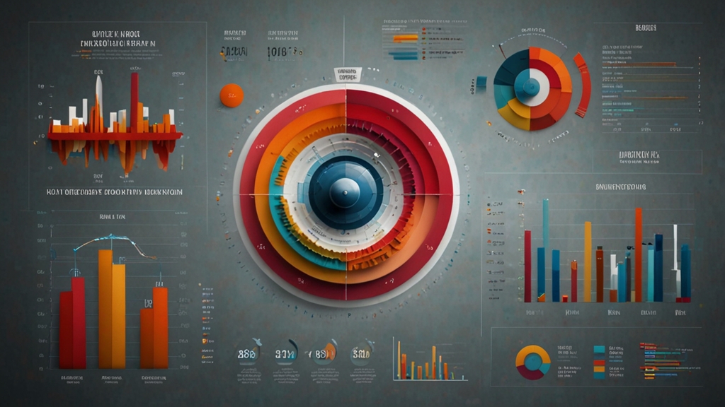
Turning Data into Visuals
At the heart of an effective infographic is the skillful transformation of raw data into visually appealing narratives. Here are some common types of visual elements used in infographics:
Charts and Graphs
Bar charts, pie charts, line graphs, and others are standard tools for representing numerical data. They help in illustrating trends, comparisons, and distributions effectively.
Icons and Illustrations
Icons and illustrations can break down complex ideas into simpler, more relatable visuals. They serve as visual metaphors, helping audiences connect abstract data with real-world contexts.
Maps
Geo-spatial data can be efficiently represented using maps. Whether it's demographic information or sales data across regions, maps offer a visual dimension to statistical data.
Timelines
Timelines are ideal for showcasing historical data or projecting future trends. They arrange information chronologically, offering a clear progression of events over time.
The Future of Infographics
As technology advances, infographics are evolving beyond static images. Interactive infographics, augmented reality (AR) data visualizations, and animated infographics are setting new standards. These formats allow users to engage actively with the data, providing a richer, more immersive experience.
"The goal is to turn data into information, and information into insight." - Carly Fiorina
In conclusion, the art of infographics seamlessly merges the precision of statistics with the creativity of visual design. When executed skillfully, infographics are not merely images adorned with numbers; they are compelling stories crafted to inform, engage, and inspire.